Responsive design is a way to put together a website so that it automatically scales its content and elements to match the screen size on which it is viewed. It keeps images from being larger than the screen width, and prevents visitors on mobile devices from needing to do extra work to read your content
Many people now use smartphones for browsing and shopping, thus emphasizing the essence of a responsive web design. A research carried out recently showed that about 25% of Americans made use of mobile gadgets to surf the internet. 20% of the world population owns a mobile phone and 50% of this population use it to access the web.
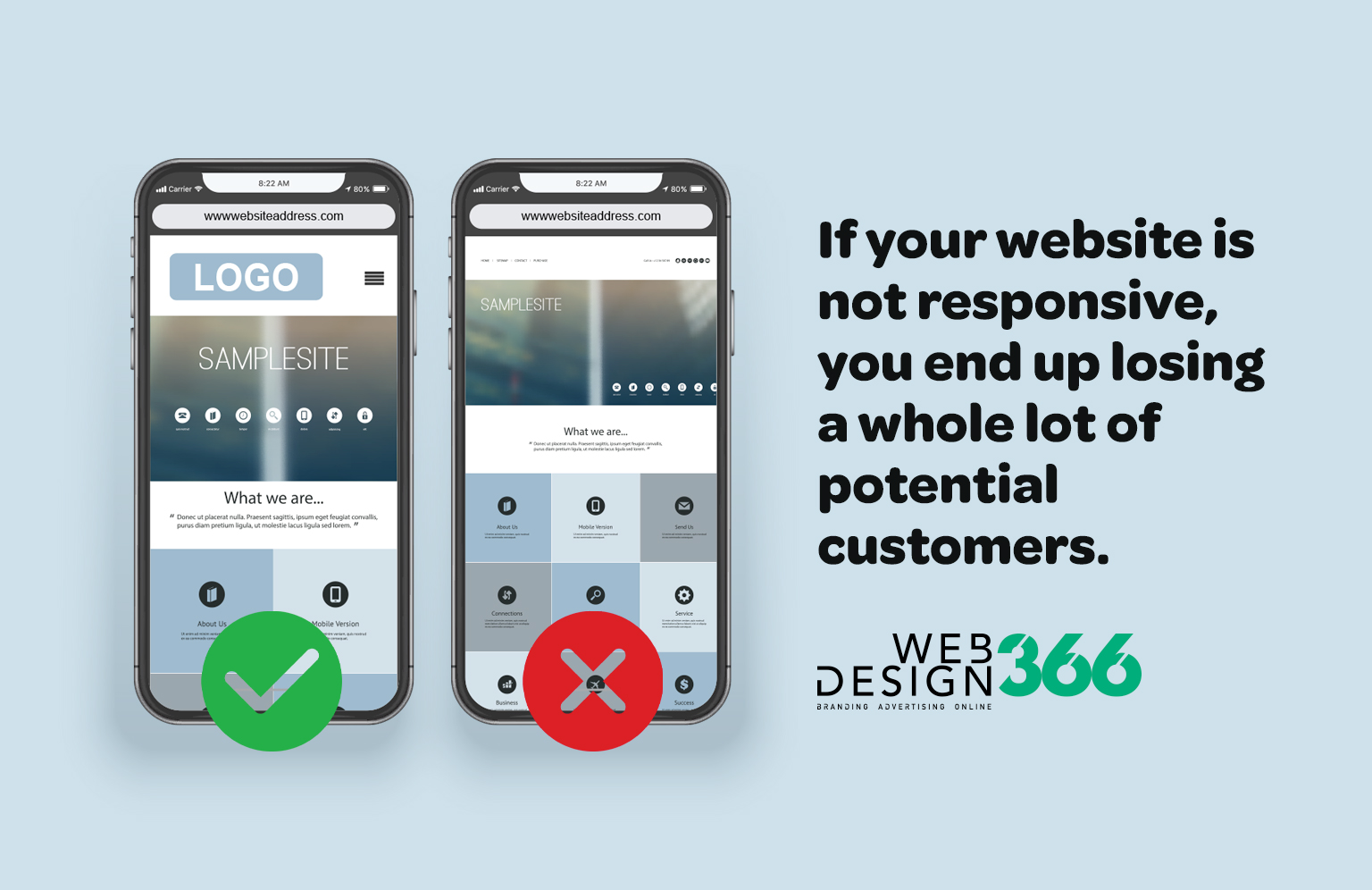
If your website is not responsive, you end up losing a whole lot of potential customers.
Additionally, websites that have responsive design tend to rank higher up on Google search engine.
Why should you opt for a responsive website?
- COST EFFECTIVENESS
Maintaining separate sites for your mobile and non-mobile audiences can get expensive. By using responsive design, you can save money by eliminating the cost of paying for a mobile site. You will only need to invest in a single site design to appeal to all visitors and all devices. - FLEXIBILITY
When you have a website with responsive design, you can make changes quickly and easily. You do not need to worry about making changes on two websites. This flexibility is a huge advantage when you just want to make a quick design tweak or fix a typo on your site—you only have to do it once. - IMPROVED USER EXPERIENCE
User experience is crucial to website owners. You want people to like your site, and you want it to be easy to use to convince them to come back. If someone visits your website on a mobile device, and it takes forever to load or your pictures do not have the proper resolution, it can make your company appear unprofessional.
No one wants to do business with a place that is unprofessional. But responsive design, which offers a much better user experience, can help convince people to give your company a chance. Because zooming and scrolling will be eliminated, content can be viewed quicker, and the overall impression that visitors have will be much more positive. - SEARCH ENGINE OPTIMIZATION GAINS
Search engine optimization, or SEO, is a strategy used by many companies to help boost themselves in Google’s search page rankings. The closer you are to the top, the better the chance potential customers will find you.
Responsive design can help with SEO because Google, as mentioned, gives preference to websites that are mobile-friendly. In combination with other SEO factors, responsiveness can help give you a big boost in search engine results. - EASE OF MANAGEMENT
Most businesses, especially smaller ones, don’t have a lot of time to update or refresh the way their website looks. But rather than having to hire a designer to handle every aspect of your website, responsive design allows you to make the changes yourself, quickly and easily.
Additionally, with just one website, other elements of your marketing will be much easier to manage. You’ll never have to wonder if you should link the mobile or desktop site on a social media update, or question whether or not all of your redirect links will be working to get the right visitors to the right site. Responsiveness takes much of the stress out of managing a business website.
Embrace responsive design for your website
If responsive website success stories don’t convince you to make the change to this way of designing, then let the cost and time savings convince you. Responsive design is an important part of any modern web strategy—and it should be part of yours, too.